

radio input
This block is part of the state ui group and was last modified in core v13.0.6.
Connection Type
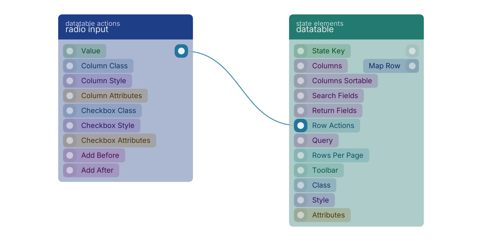
This block connects from a statedatatableconnection type block. Make sure to connect this block to the appropriate left-hand side connection.
radio input v13.0.6 Adds a radio input that can be placed anywhere in the row.
- value
valueThe value that will be set in the selection. It is possible to use {{ guid }} in the value to insert the guid of the row being rendered.
- column class
uiclassHidden when unused
- column style
uistyleHidden when unused
- column attributes
uiattributesHidden when unused
- checkbox class
uiclassHidden when unused
- checkbox style
uistyleHidden when unused
- checkbox attributes
uiattributesHidden when unused
- add before
fielddefinitionsAdds the checkbox before the given column. • Hidden when other fields are filled
- add after
fielddefinitionsAdds the checkbox after the given column. • Hidden when other fields are filled
- statedatatableconnection
statedatatableconnection
A typical wiring for radio input: the statedatatableconnection out pin feeds datatable.
Version history
Introduced in v13.0.6.
Back to
state ui Return to the main group to view all sub-groups Back to datatable actions Return to the group to view all blocks within this group